
The Art of Colour
Detail, “Trois cent nuances et comment les marier” by A. Desaint
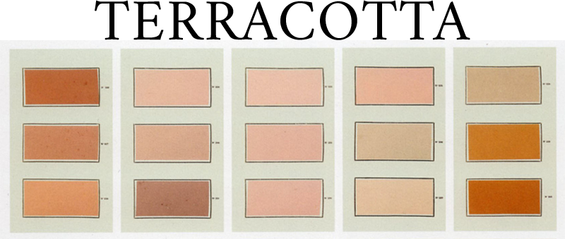
OR RED OCHRE, FADED GARANCE, ETRUSCAN RED
Terracotta covers a wide range of warm and organic shades going from carmine oranges to greyish pinks, evoking red grounds, skin, as well as slightly fainted flowers.
Its beauty and refinement is due to a delicate balance between red/yellow pigments and elements of grey and purple.
Often seen on antique Etruscan or Egyptian earthware, it is also the main shade of rustic clay floors. During the 18th century, Terracotta – in a more lilac and fresher looking version, goes sophisticated and becomes a popular paint color among the british high society.
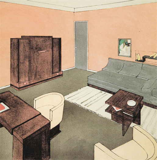
Louis Sognot, “Chambre-Studio”, Répertoire du goût moderne, Editions Albert Lévy, 1928-29
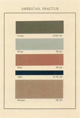
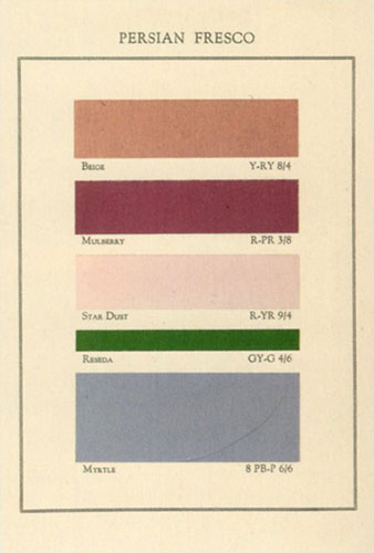
Planches, “A Tint Book of Historical Colours”
Thomas Parson, 1934
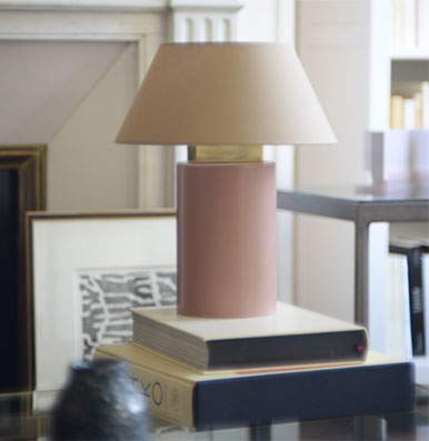
Bolet lamp small size, Terracotta and String, Eo Ipso Studio
WITH NEUTRALS : MASTIC, GRÈGE, CHARCOAL, FADED KAKI
This is a strong and very modern color combination, which requires high precision in the color mixing process. This color scheme can be referring to the masculine edge of some 30s interior designs, mixing rosy wooden furniture with luxurious cream and grège wall coverings.
Red and orange pigments saturated, the Terracotta color warms up neutrals and gives them a singular and intriguing touch. It works surprisingly well with cold and greenish tones, like lichen grey and sage greens. The complementarity of colors creates a unique, bold and refined energy.
Terracotta can also be mixed to warmer beiges, sandy or woody tones, in order to create soft and easy color palettes. In any case, adding in faux black, charcoal, slate-grey details will bring rhythm and structure.
TOMETTE & COULEURS FRAICHES
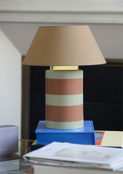
Bolet lamp small size, Terracotta, Lichen and String, Eo Ipso Studio
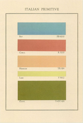
Terracotta, when it comes close to coral pink, works great with simple and bright colors like sky blue, lime or leaf green, in the spirit of the Italian Primitives.
The softness and organic feel of the color, mixed with the acid shine of lime and blue green, allows to compose intense and joyful combinations. Using slightly off tones is better to keep a more natural and elegant feel.
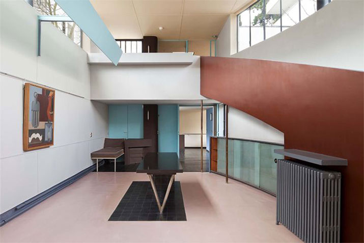
Maison La Roche in Paris, Le Corbusier, 1923-1925
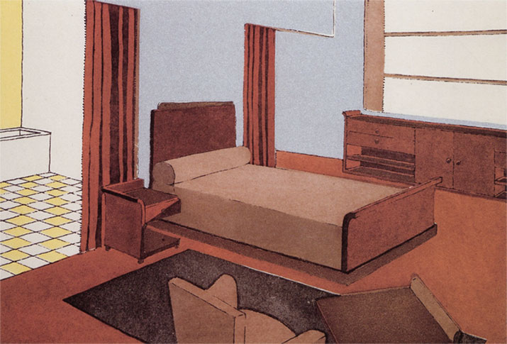
Etienne Kohlmann, “Chambre d’homme”, Répertoire du goût moderne, Editions Albert Lévy, 1928-29
Some great modernist architects have worked on this kind of color scheme, using large and deep painted surfaces to define living and moving areas.
These color games were meant also to underline the volumes and outline of the building, adding a whimsical and unique touch to an otherwise pared-down design.
The Maison La Roche designed by Le Corbusier and located in the 16th district of Paris, is a great exemple of this kind of color match.
Using more than twenty different tones throughout the house, Le Corbusier has applied a deep brownish Terracotta on the imposing ramp of the entrance hall, which resonates in a spectacular way with the turquoise and sweet pink of the floor and walls.